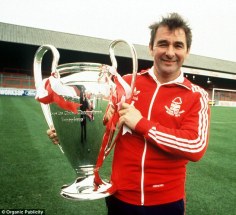
Second on the list of teams to re-brand and the feature of this post are Nottingham Forest. I had a lot of fun re-designing Sheffield United’s badge in my last post on this topic. This is another piece of iconic branding in world football, made famous by Brian Clough’s Europe conquering teams of 1979 & 1980.
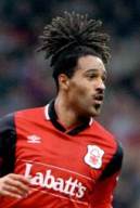 I remember watching Forest on Match of the Day in the 90s; big Mark Crossley in goal, Jason Lee (right) with his pineapple head, the ever passionate Stuart Pearce and many more household names of 90s Premiership football.
The best memory I have comes from their visit to Chesterfield in the 1996/97 F.A Cup, which they lost thanks to a Tommy Curtis penalty much to my delight! I went to that game, certainly one that I will always remember.
Their current and famous logo has been in place since 1974. While it was seen as modern branding back then, it could be time for a change at City Ground.
History.
[Source: historicalkits.co.uk]
Formed in 1865 by group of field hockey players their team name comes from their original home, Forest Recreation Ground, named after Sherwood Forest.
Forest initially refused an invitation to join the Football League in 1888 fearing that the F.A would punish those that joined. A year later, they joined the rival Football Alliance instead and subsequently the Alliance was incorporated into the Football League as Division Two.
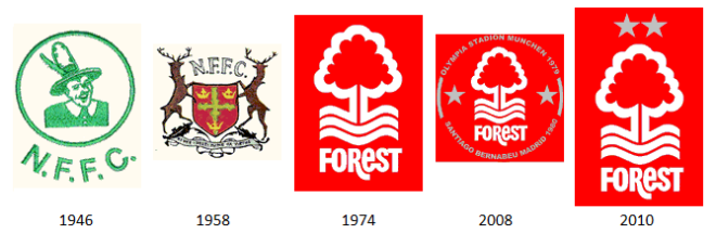
The team haven’t gone through many image changes, having only had 3 different crests in the club’s long history.
Their first was a bizarre image of Robin Hood wearing a massive cowboy hat and a crazy look on his face. This was soon replaced by a modification of Nottingham’s coat of arms. The centre piece of which was a green cross, supposedly representing Sherwood Forest and 3 golden crowns which signified loyalty to the Royal family. It also featured 2 stags each side supporting the centre piece.
In 1974 is was replaced by the image we have seen for decades. The tree represents the Major Oak at Sherwood Forest with the waves making reference to the River Trent. They later added 2 stars as a nod to their European success and as you can see above added some text circulating the crest in 2008 in reference to their first European Cup win.
Much like Sheffield United this season Forest are celebrating a big anniversary, 150 years so again, like The Blades what better time re re-brand?
My design.
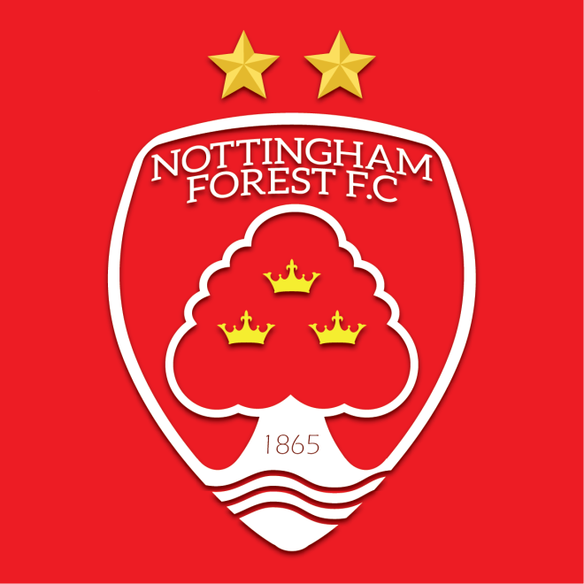
The first thing I did was put the city name Nottingham in the crest. I feel this has been missing for too long.
I decided to go with a modern ‘bloated’ shield look, keeping the 2 starts above it that represent the side’s success in Europe under Brian Clough.
(Quick plug here for the movie ‘The Damned United’ it if you haven’t seen it please do. Incredible insight into Clough’s personality through his time with Derby County & Leeds United).
Also, although I haven’t seen it yet I have been informed of a film called ‘I Believe in Miracles’ which covers Brian Clough & Nottingham Forest in their European Cup triumphs of 1979 & 80. That looks like one to watch. Thanks to twitter user @Main0ffender for pointing me in the direction of it, I’ll be giving that a watch at the weekend!)
The Major Oak remains the centre piece in my design with the trunk blending into the shield outline. I also decided to bring back the 3 crowns, as not only a nod to their history and the Royals, but it adds a splash of different colour to the crest. Similar to many other football emblems, it also features the year the team was established.
*EDIT*
Comments on this post from Nottingham Forest fans made me aware that I had missed out vital components in this design due to a lack of thorough research.
The Major Oak should have 11 branches, which my first design did not and the River Trent has been integrated. I thought it would clutter the badge too much, but have found a way to integrate it that I believe is a little different.
I never intended on offending any Forest fans doing this. I simply did not do enough research. I hope this design is now a little closer to something that would be accepted by Forest fans.
Future posts will involve deeper research so as to not cause any further issues of this kind. That being said, manners and respect go a long way :).
In closing.
The goal here was to create something modern while referencing their history, something all teams should keep in mind when introducing new branding. It was important for me to try something completely new shape wise with this one. I’m happy with the end result.
I’d love to hear your thoughts so get in touch in the comments below or via twitter @jasonkallend. Next up in this project is a fresh approach for Blackpool.
*PLUG TIME* For your graphic design needs please don’t hesitate to get in touch. Click here for a link to my website which has a temporary portfolio and contact information. Thanks!
