
Second on the list of teams to re-brand and the feature of this post are Nottingham Forest. I had a lot of fun re-designing Sheffield United’s badge in my last post on this topic. This is another piece of iconic branding in world football, made famous by Brian Clough’s Europe conquering teams of 1979 & 1980.
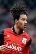 I remember watching Forest on Match of the Day in the 90s; big Mark Crossley in goal, Jason Lee (right) with his pineapple head, the ever passionate Stuart Pearce and many more household names of 90s Premiership football.
The best memory I have comes from their visit to Chesterfield in the 1996/97 F.A Cup, which they lost thanks to a Tommy Curtis penalty much to my delight! I went to that game, certainly one that I will always remember.
Their current and famous logo has been in place since 1974. While it was seen as modern branding back then, it could be time for a change at City Ground.
History.

[Source: historicalkits.co.uk]
Formed in 1865 by group of field hockey players their team name comes from their original home, Forest Recreation Ground, named after Sherwood Forest.
Forest initially refused an invitation to join the Football League in 1888 fearing that the F.A would punish those that joined. A year later, they joined the rival Football Alliance instead and subsequently the Alliance was incorporated into the Football League as Division Two.
The team haven’t gone through many image changes, having only had 3 different crests in the club’s long history.
Their first was a bizarre image of Robin Hood wearing a massive cowboy hat and a crazy look on his face. This was soon replaced by a modification of Nottingham’s coat of arms. The centre piece of which was a green cross, supposedly representing Sherwood Forest and 3 golden crowns which signified loyalty to the Royal family. It also featured 2 stags each side supporting the centre piece.
In 1974 is was replaced by the image we have seen for decades. The tree represents the Major Oak at Sherwood Forest with the waves making reference to the River Trent. They later added 2 stars as a nod to their European success and as you can see above added some text circulating the crest in 2008 in reference to their first European Cup win.
Much like Sheffield United this season Forest are celebrating a big anniversary, 150 years so again, like The Blades what better time re re-brand?
My design.

The first thing I did was put the city name Nottingham in the crest. I feel this has been missing for too long.
I decided to go with a modern ‘bloated’ shield look, keeping the 2 starts above it that represent the side’s success in Europe under Brian Clough.
(Quick plug here for the movie ‘The Damned United’ it if you haven’t seen it please do. Incredible insight into Clough’s personality through his time with Derby County & Leeds United).
Also, although I haven’t seen it yet I have been informed of a film called ‘I Believe in Miracles’ which covers Brian Clough & Nottingham Forest in their European Cup triumphs of 1979 & 80. That looks like one to watch. Thanks to twitter user @Main0ffender for pointing me in the direction of it, I’ll be giving that a watch at the weekend!)
The Major Oak remains the centre piece in my design with the trunk blending into the shield outline. I also decided to bring back the 3 crowns, as not only a nod to their history and the Royals, but it adds a splash of different colour to the crest. Similar to many other football emblems, it also features the year the team was established.
*EDIT*
Comments on this post from Nottingham Forest fans made me aware that I had missed out vital components in this design due to a lack of thorough research.
The Major Oak should have 11 branches, which my first design did not and the River Trent has been integrated. I thought it would clutter the badge too much, but have found a way to integrate it that I believe is a little different.
I never intended on offending any Forest fans doing this. I simply did not do enough research. I hope this design is now a little closer to something that would be accepted by Forest fans.
Future posts will involve deeper research so as to not cause any further issues of this kind. That being said, manners and respect go a long way :).
In closing.
The goal here was to create something modern while referencing their history, something all teams should keep in mind when introducing new branding. It was important for me to try something completely new shape wise with this one. I’m happy with the end result.
I’d love to hear your thoughts so get in touch in the comments below or via twitter @jasonkallend. Next up in this project is a fresh approach for Blackpool.
*PLUG TIME* For your graphic design needs please don’t hesitate to get in touch. Click here for a link to my website which has a temporary portfolio and contact information. Thanks!

Sorry that’s awful. You missed the fact the tree has 11 branches for a start (think about it) and the damned united is a slur against Clough. Throw in the fact you’ve just dismissed the river Trent part of the logo as irrelevant when it is a vital part of our identity (see mull of kintyre/mist rolling in from trent). You probably should do research before embarking on projects!
LikeLike
I’ve allowed this comment because somewhere, amidst all of that negativity and abrupt tone I believe is some constructive criticism. I’ll accept that I could have done a little more research. One of the purposes of this project is to learn as I go. I apologise that I have made mistakes in this area. I don’t believe The Damned United is a slur against Clough, furthermore my opinion of the movie was simply shared as a suggestion for those to watch it that hadn’t and it has nothing to do with the finished design. Thank you for taking the time to read and get in touch.
LikeLike
The comments made by Trent End Red are very valid and you seem to have just dismissed them ..
Another point that should be made is that you can’t use the city crest because the council won’t allow it, that’s why it’s been missing for so long… I believe enquiries were made to incorporate it into a 150 year anniversary badge but permission was refused. .
LikeLike
I certainly did not dismiss anything on Trent End Red’s comment. I hold my hands up and apologise for my negligence. I will be revising the design and updating this post in due course. With regards to your mention of the council, does this affect the use of ‘Nottingham’ and the crowns?
LikeLike
Trust me, based on the way some fans are over their clubs my tone is positively meek. Still don’t like it though, looks a bit like a mushroom cloud now I’m afraid and too cluttered IMO. Sometimes the best redesign is to do nothing. The existing logo is unique, recognised worldwide. As a designer you can’t be upset by comments, comes with the territory. I do think you’re being very brave dipping into football club badges. Buy a supply of hard hats!
LikeLike
Thanks for getting back in touch and sharing your opinion of the revised design. I should have done more research so I appreciate your initial comment too. The design itself has received mixed reviews through the different platforms it’s been shared on which I did expect, especially with it being Forest. While I agree that sometimes a club would be better off leaving the crest as it is the idea behind this is a very much ‘what if’. Thanks again.
LikeLike
I’ve just seen this so I’m coming late to it. I don’t like criticising other peoples work as I do some art things myself and criticism hurts.
The beauty (to Forest fans at least) of the club crest is it’s simplicity, individuality and recognisability. I sorry to say that you have taken a classic and downgraded it to the mundane.The shape is reminisant of the Burton and Arsenal logos. Sadly the current Arsenal crest isn’t a patch on the classic logo of the early 19702 one which was just the cannon itself. Similarly Sheffield Wednesdays best crest ever is still the simple owl of the 1970-1984 period.
It shouldn’t be necessar to put the founding date on the crest, the fans should know it and it’s relatively easy for anyone else to find it these das if they want to. You do find that some teams who put the dates on are trying to sell a fact which isn’t actually true.
The three crowns you put in the design don’t really have anything to do with the club.
The thing though I find so wrong about it is that when I see it I immediately think bottle opener. Pust the bottom of the tree against the bottle cap and push the other end down to lift the cap off. Not the best way to see your clubs crest is it.
Basically for me the only way to modernise and improve the Forest crest is the win another European trophy and add another star. I can’t see that happening anytime soon though.
LikeLike
Late to it? Why it was only posted some SEVEN years ago and as you’d see this project is long forgotten, to the point I’d completely forgotten about it until I had an email about your comment. Thanks for taking the time to write all of that I guess.
A lot of these designs are quite bad looking back, but it was early days in my design journey. I’ve had a bit of a disliking for Forest ever since I did this funnily enough, but my find memory of lowly Chesterfield knocking them out of the FA cup in the 1996/97 season is a very fond one!
Happy Easter 2023
LikeLike
Yes, I saw after pressing send that it was an old page. I’m all for people having a go at desiging crests, but the Forest one and Derby ones are very iconic and easily recognisable which is what you want for your branding. What youput up was something akin to the Leeds crest with the ‘chest pump’ on. What were they thinking, What was you thinking? ;O)
I was born in Derbyshire, so I have a soft spot for Chesterfield too.
If Forest was going to lose to anyone Chesterfield would be high on my list of those to do it as they needed the money (not that Forest didn’t then).
Anyway sorry for the rant. Hope you’re keeping up on the design work.
LikeLike